Case Study · Mobile App 2025 · Nuclio Digital School
⏱ 7 min read

LOUD!
The stage
is waiting.

A mobile app that connects emerging musicians with music venues. No middlemen, no inbox chaos, no month-long back-and-forth to book a stage.

Role
UX/UI Designer
Duration
4 months
Team
5 people · Final Project
Tools
Figma
Starting point
✦   context   ✦

The lay of the land
before drawing plans.

Context

Spain's live music market generates over €725M per year. Yet only 1 in 4 artists manages to live off their music. In Madrid and Barcelona, more than 20 gigs by emerging bands take place every week and most of them happen through personal contacts, not through any system.

The market exists. The talent exists. What's missing is the digital infrastructure to connect them efficiently and without friction.

The challenge

Design a platform that works simultaneously for two user groups with opposing needs: emerging musicians who need visibility and access, and venue managers who need efficiency and trust.

One single app. Two audiences with completely different friction points.

Business objectives
Connect musicians and venues without intermediaries
Daily engagement rate of 60%+ in testing
Monthly retention of 70%+
Stand out from existing generic platforms
Research and discoveries
✦   research   ✦

What we listened to
before designing.

Research methods
  • Desk research · Spanish music market analysis and competitive benchmarks
  • 6 in-depth interviews with musicians and venue managers
  • 30 quantitative surveys (musician profile)
  • Direct and indirect competitor analysis
Scarcity of information

Zero visibility

70% of musicians identify lack of visibility in events and venues as their main challenge regardless of their level of talent or experience.

Portfolio analysis

Access barriers

73.3% agreed that limited connections and high associated costs are the main obstacles to getting on stage.

Lack of context

Chaotic communication

Venues and musicians coordinate via email and social media channels that generate misunderstandings, delays, and missed opportunities on both sides.

"Organising gigs independently is an exhausting and complex process. You don't know where to start, or whether anyone will ever get back to you."

Emerging musician · In-depth interview · Barcelona, 2025
User Personas
✦   two archetypes, one product   ✦

Two archetypes,
one single product.

Sofía

Sofía · The Motivated Beginner

Emerging musician · 24 years old · Guitarist · Zaragoza
Goals
  • Connect directly with venues without relying on personal contacts
  • Build visibility beyond social media platforms
  • Land her first paid gig at a real music venue
Pain points
  • Spends hours sending emails that never receive a reply
  • Has no track record to back up her talent with new venues
  • Technical issues on stage affect the quality of her performances
David

David · The Experienced Manager

Venue manager · 38 years old · Events programmer · Barcelona
Goals
  • Find emerging talent that matches his venue's audience profile
  • Centralise all artist management in a single place
  • Reduce the risk of booking artists without enough information
Pain points
  • Receives unstructured proposals with no clear evaluation criteria
  • Email communication creates delays and constant misunderstandings
  • Booking unknown artists carries real financial risk
Defining the problem
✦   how might we   ✦

Three questions
that guide the design.

HMW · 01

How might we help musicians and venues find each other and agree on terms without relying on middlemen or informal channels?

HMW · 02

How might we give artists enough visibility for venues to trust booking them even without an established track record?

HMW · 03

How might we simplify the entire gig process from first contact to confirmation into a single, friction-free flow?

Direct communication

No emails, no social media. One dedicated channel with a full history of every negotiation.

Verified profiles

Digital press kit + performance history + real ratings that give every proposal credibility.

Smart filtering

Genre, location, venue capacity and availability so every venue finds the right artist.

Reliable ratings

A two-way verified system backed by real performances. No rating without a confirmed gig.

Design Process
✦   from idea to interface   ✦

From idea to interface,
iterating out loud.

Wireframes & Iteration

Wireframes & iterations

We started with paper sketches, moved to low-fidelity wireframes in Figma, and validated them through tree testing and card sorting. The application user flow was the most iterated piece we mapped every decision point before designing a single high-fidelity screen.

User flow · task flow · wireframes LOUD!
S

Smart Metrics

We defined success metrics before designing the screens: application time, venue response rate, and user satisfaction after the first interaction.

C

Contextual Components

Digital press kits for musicians, technical spec sheets for venues. A negotiation system built into the chat that eliminates the ambiguity of informal agreements.

B

Branding & System

A visual identity built on the energy of live music. Orange #FF6F29 on black #1D1D1B. A coherent design system covering both user profiles.

L

Learning Tooltips

A progressive onboarding that teaches without blocking. Users see the value before filling in their full profile — a critical decision for our completion rate.

Home · opportunities + venues
Artist profile · press kit + rider
Chat · terms negotiation
Onboarding · 5 screens
Testing & Iteration
✦   what we learn when real users take over   ✦

What we learn when
real users take over.

Every testing round revealed friction points that wireframes couldn't anticipate. Three iterations, three better versions.

Problem Solution

Too many required steps during onboarding. 4 out of 6 musicians didn't finish the registration — the app was asking for too much information before showing any value. We redesigned the flow: users explore first, complete their profile later.

Problem Solution

The artist profile prioritised text over audio. Venue managers listened to the music sample before reading any description. We reordered the profile card: photo and audio first, secondary information below.

Problem Solution

The rating system felt untrustworthy at first. Without real evidence, numbers don't convince anyone. We added verification tied to confirmed past gigs — no confirmed performance, no rating.

Complex dashboard · before

Overloaded main screen

The home screen showed 12 possible actions with no clear hierarchy. Venue managers needed over 3 minutes to find new applications.

Simplified · after

Streamlined screen with priority notifications

We reduced it to the 3 most frequent actions. Time to reach new applications dropped to under 30 seconds in subsequent testing sessions.

Final Solution
✦   the product   ✦

An ecosystem,
not just an app.

A platform where the music never stops.

LOUD! is the infrastructure that turns connecting musicians and venues into something predictable, transparent and friction-free. Both sides get what they need. The stage fills up.

Final LOUD! product screens
Process at a glance
✦   what the process looked like in numbers   ✦

The work,
in numbers.

6
In-depth interviews
Musicians and venue managers
30
Surveys completed
Quantitative musician profile
4/6
Onboarding completed
After redesigning the flow
3
Iteration rounds
Research → wireframes → hi-fi

Key Learnings

Five things I carry into every project from now on

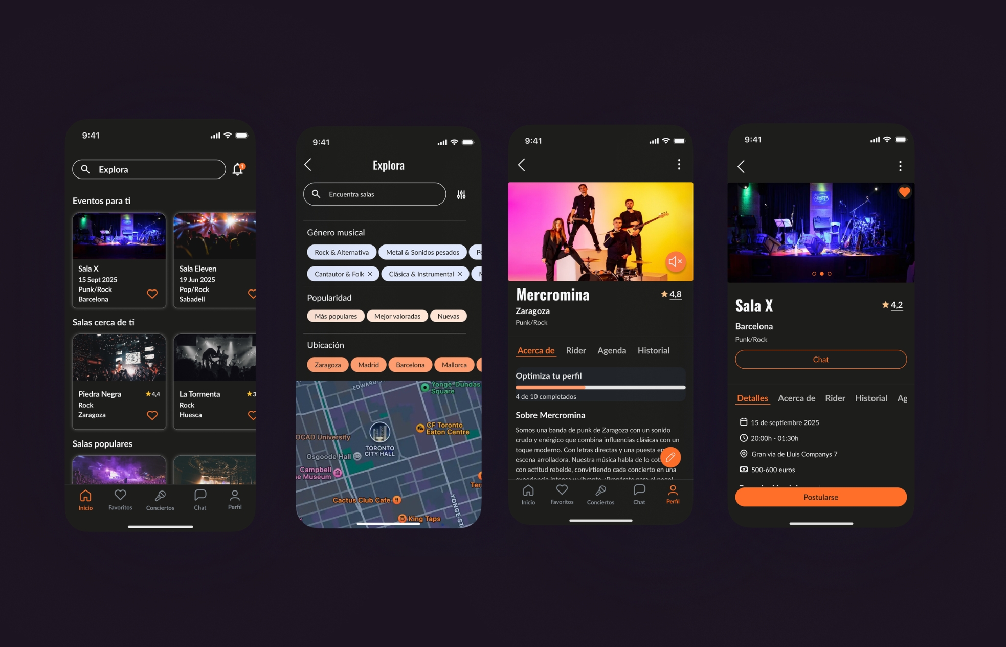
Dual audience · tension by design

Designing for two users means designing for the tension between them.

Every interface decision had to work for both musicians and venue managers at the same time. This pushed me to question every assumption about what information was "obvious" — because it was obvious to one group and completely invisible to the other.

Takeaway · map both mental models before sketching anything
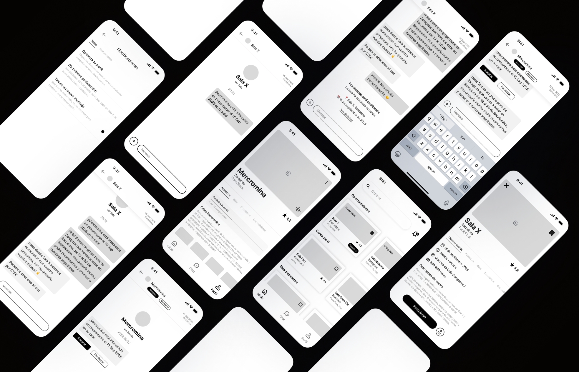
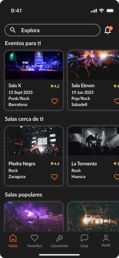
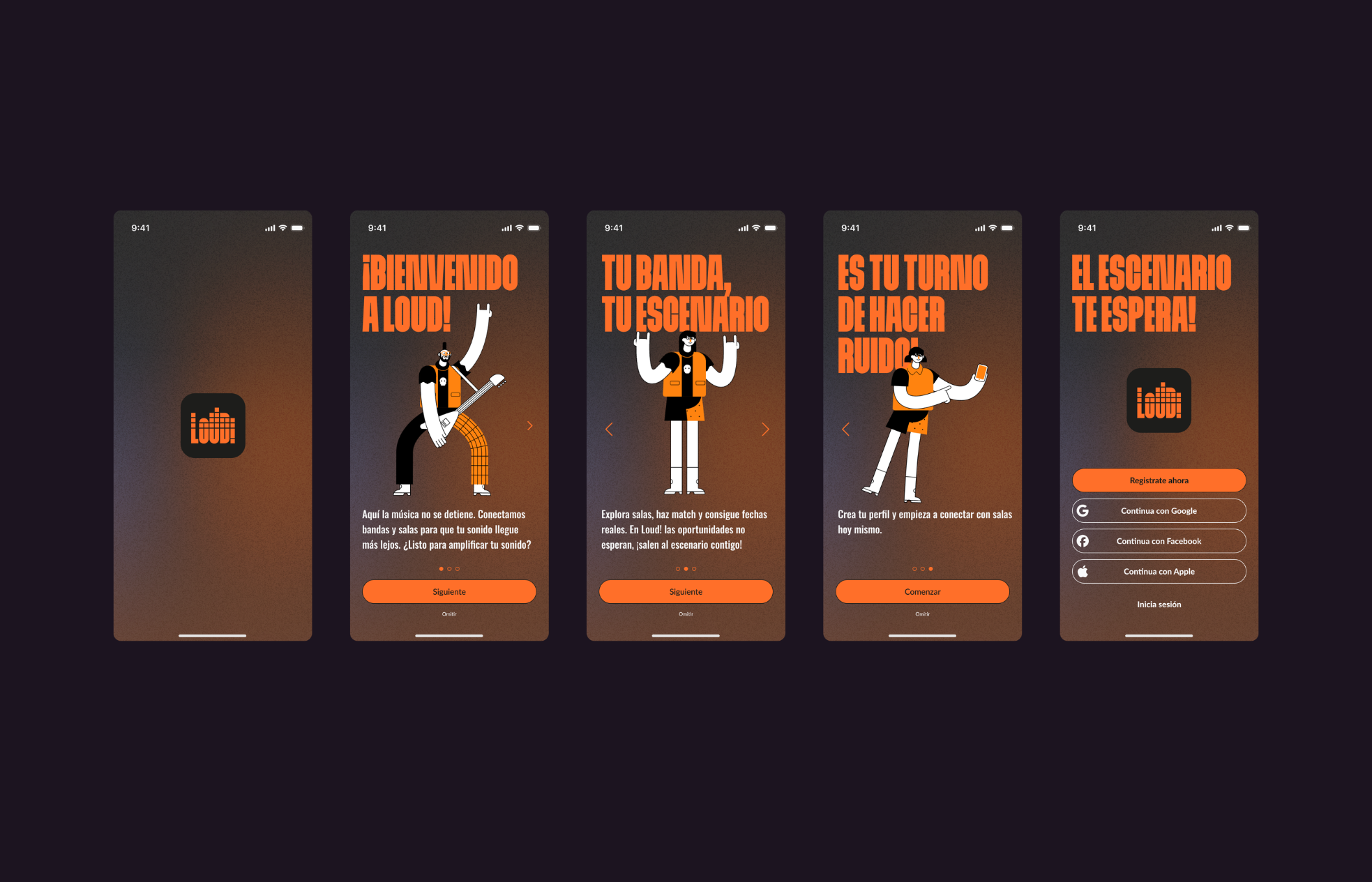
Onboarding · first impressions

The onboarding is the product.

Losing a user in the first few steps means losing them permanently. Reducing friction during sign-up — letting users explore before completing their profile — was the single decision with the greatest impact on our completion rate.

Takeaway · show value before asking for effort
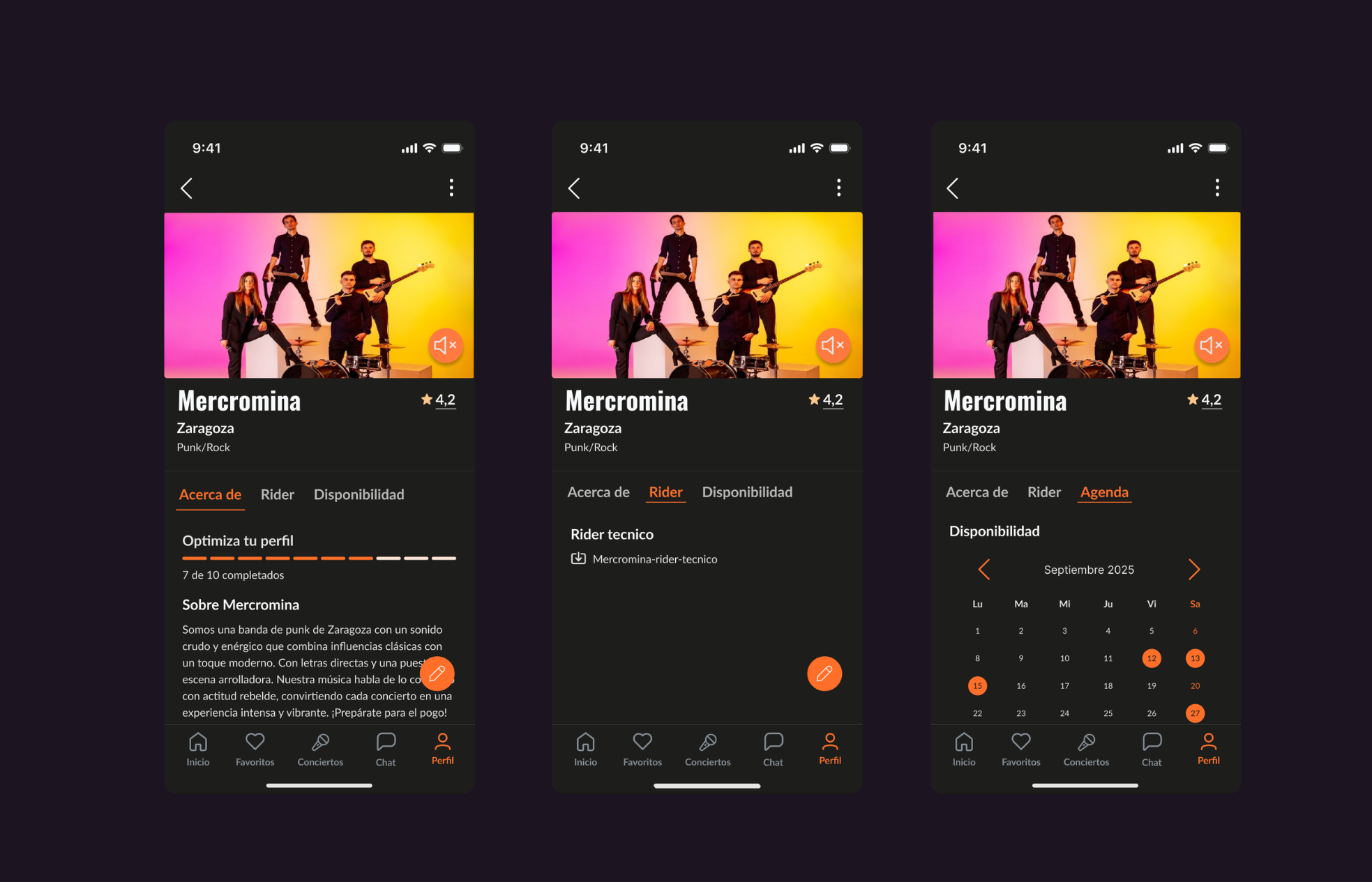
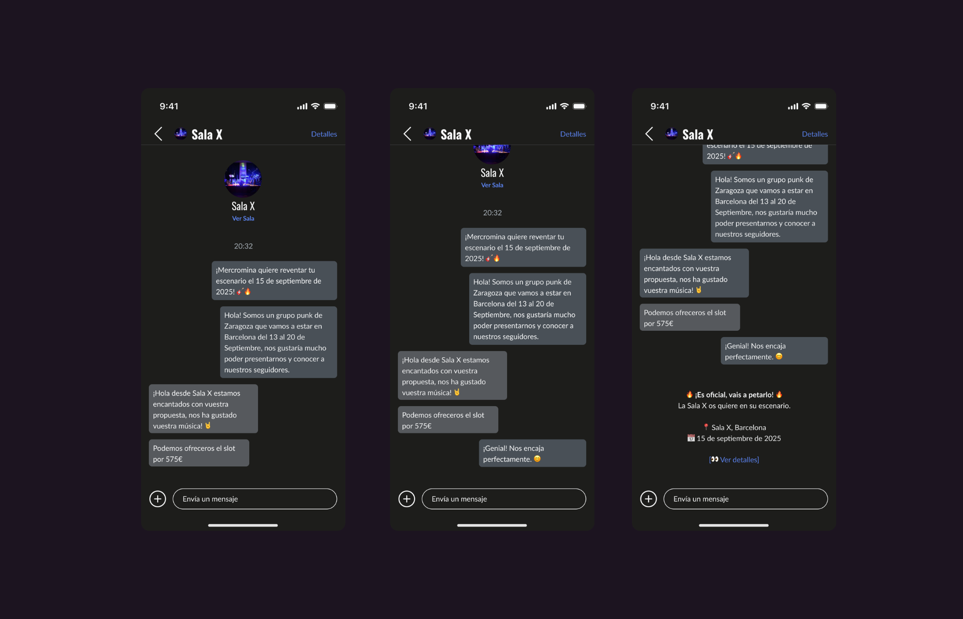
Trust · systems & evidence

Trust is designed, not assumed.

Our rating system failed in early testing because it lacked real evidence. Numbers alone don't convince anyone — neither musicians nor managers. Tying ratings to verified past performances completely changed the perceived credibility of the system.

Takeaway · every trust signal needs a verifiable source
Process · flows before screens

Iterate on flows before touching screens.

Mapping the user flow before opening Figma forced us to answer questions we would have ignored until testing. What happens if the venue doesn't reply? What if the user isn't logged in? These edge cases shaped the design more than any visual decision did.

Takeaway · decision points reveal the real design problems
Research · collective intelligence

A team of five multiplies your research.

Five perspectives during interviews captured nuances that a single researcher would have missed. The collective synthesis — discussing what each person heard differently — was as valuable as the raw data itself.

Takeaway · collaborative synthesis surfaces the gaps in your own assumptions
"Good research doesn't just answer your questions — it reveals the questions you forgot to ask."
Valentina Mejía · LOUD! · 2025